Why Consistent Brand Colours are Crucial for Building Recognition

Maintaining consistency in brand colours is one of the most powerful yet simple ways to strengthen brand recognition. Your brand colours aren’t just a design element; they’re a key tool in your brand’s identity, acting as a visual shortcut that helps people instantly recognise your business.
In this blog post, we’ll explore why it’s essential to stick to your brand colours across all platforms, how colour psychology plays into branding, and how consistency in colour use can increase brand recall. We’ll also share practical tips to ensure that your brand’s colour palette is appropriately used everywhere. Let’s dive in!
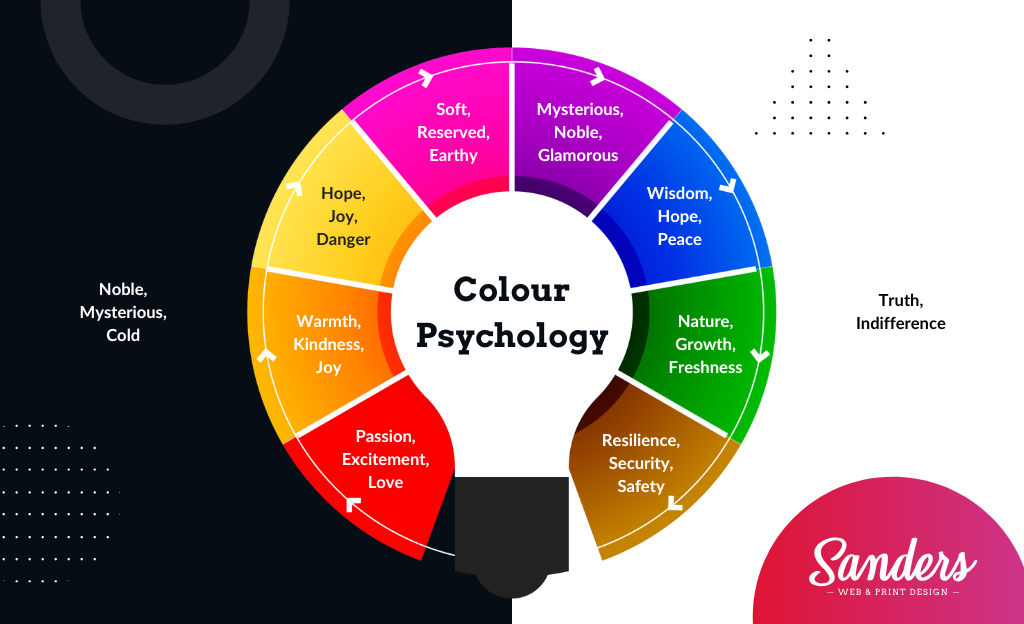
The Psychology Behind Colours in Branding
Have you ever noticed how certain colours make you feel? That’s no accident. The colours you see every day have a profound effect on your emotions and can even influence decision-making. In branding, colour psychology is crucial because it helps businesses evoke the right feelings and responses from their target audience.
For example:
- Red often signifies excitement, passion, or urgency.
- Blue is calming and conveys trust, reliability, and professionalism.
- Yellow evokes feelings of happiness and optimism.
- Green symbolizes nature, health, or wealth.
By choosing the right colour combination for your brand, you can convey specific emotions and messages. But it’s not just about choosing a colour that resonates with your audience-it’s about using that colour consistently across all platforms. When done right, consistent use of brand colours can evoke an emotional connection with your audience, which plays a huge role in customer loyalty and trust.

How Consistent Colours Increase Brand Recall
When you see McDonald’s golden arches or Coca-Cola’s red logo, you instantly know the brand. This is the power of colour in action! Studies have shown that people are far more likely to remember something if it’s tied to a specific colour. Consistent use of your brand’s colours helps your business stick in people’s minds, even when they’re not consciously thinking about your brand.
Here’s why consistent colours improve brand recall:
- Visual Memory is Powerful: Human brains are wired to process visuals faster than words. When your brand colours are consistent, people can quickly recognise your business even before reading your name or slogan.
- Creates a Cohesive Experience: When people encounter your brand in different places-whether on your website, social media, or packaging-seeing the same colours fosters a sense of familiarity and trust. Over time, this builds a connection where your audience instantly associates your colours with your products or services.
- Reduces Confusion: If your brand colours are inconsistent, people might not immediately recognise your business, which can lead to confusion or a weaker impression. Keeping your colours uniform across all media ensures that every interaction reinforces your brand image.
Tips for Ensuring Your Brand Colours Are Used Properly

Now that we know why brand colour consistency is crucial, let’s talk about how to make sure your colours are used correctly across all platforms. This can be especially challenging if you have multiple designers or different departments handling your branding.
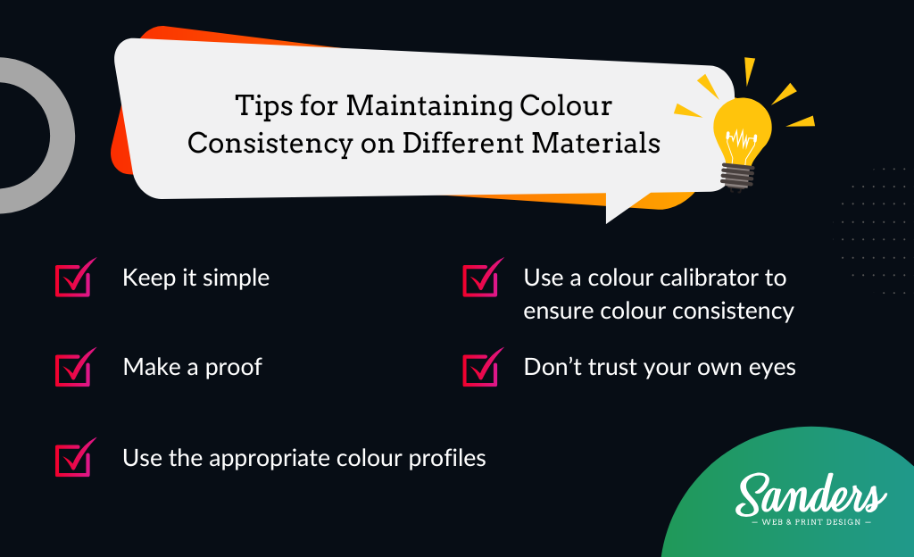
Here are some actionable tips to maintain consistency:
1. Create a Brand Style Guide
A brand style guide is your blueprint for consistent design. It should clearly define your brand’s colours (with exact codes for print and digital use), fonts, logo usage, and even tone of voice. This ensures that anyone who works on your brand-from designers to marketers-has a clear understanding of how to implement your brand’s visual elements correctly.
Include in your guide:
- Primary and Secondary Colours: List the exact colour codes (e.g., HEX, RGB, CMYK) to ensure colours look the same on both digital screens and in print.
- Usage Rules: Specify when to use the primary colours and when to introduce secondary colours.
- Colour Proportions: Provide guidance on how much of each colour should be used to maintain the correct visual balance.
2. Use Brand Colours Consistently Across All Platforms
Make sure your brand colours are used the same way on every platform. This includes:
- Website: Ensure that your web design reflects your brand colours. This includes your buttons, headers, footers, and even text highlights.
- Social Media: Your brand colours should be incorporated into your profile images, posts, and even advertisements.
- Print Materials: Business cards, flyers, brochures, and product packaging should all feature your brand colours consistently.
- Uniforms and Signage: If you have physical stores or employees wearing branded uniforms, these should also reflect your colour scheme.

3. Audit Your Branding Regularly
It’s easy for small inconsistencies to creep in over time. To avoid this, regularly audit your brand’s colour usage across all touchpoints. Check your website, social media, email campaigns, packaging, and any other materials to ensure that your brand colours are being used correctly. If you notice any inconsistencies, fix them as soon as possible to keep your brand image unified.
4. Leverage Digital Tools
There are several tools that can help ensure your colours are used consistently. For example:
- Canva and Adobe Creative Cloud Libraries: These platforms allow you to save your brand colours, logos, and fonts so they’re easily accessible by anyone on your team.
- Brand Monitoring Tools: Tools like Brandwatch or Mention can help you track your brand’s appearance online, including the correct use of your brand colours.
5. Train Your Team
Your team is responsible for creating and sharing your brand’s visual identity, so it’s important that they understand how to use your brand colours properly. Provide training on your style guide, and encourage your team to ask questions if they’re unsure about how to apply your branding correctly.
Conclusion: Actionable Steps to Audit and Unify Your Brand’s Colour Usage

Now that we’ve covered the importance of brand colour consistency, it’s time to take action! Here’s a simple plan to audit and unify your brand’s colour usage:
- Review Your Existing Branding: Gather all of your brand materials, from your website to your social media posts, and review them to check for consistency. Make a note of any areas where your brand colours are being used incorrectly.
- Create or Update Your Style Guide: If you don’t have a brand style guide, now’s the time to create one! Include your brand colours, logos, and usage rules to ensure everyone stays on the same page.
- Implement Changes Across Platforms: After auditing your branding, update any areas where your colours are inconsistent. This might mean redesigning some assets, updating your website, or tweaking your social media profiles.
- Monitor Consistency Going Forward: Regularly audit your branding and provide feedback to your team to ensure your brand colours stay consistent in the long term.
Consistent brand colours aren’t just a design choice-they’re a powerful tool for building recognition, trust, and loyalty. By following these steps, you’ll ensure that your brand’s colour palette is working for you, helping your business stand out and stay memorable in a crowded marketplace.
Ready to take your branding to the next level? Talk to Sanders Design today for expert help in building a stunning and consistent brand identity that drives growth.


Author: Martin Sanders
I empower businesses to connect with their customers and boost sales. Ready to take your revenue to new heights? Get in touch with me today, and let’s make it happen!


