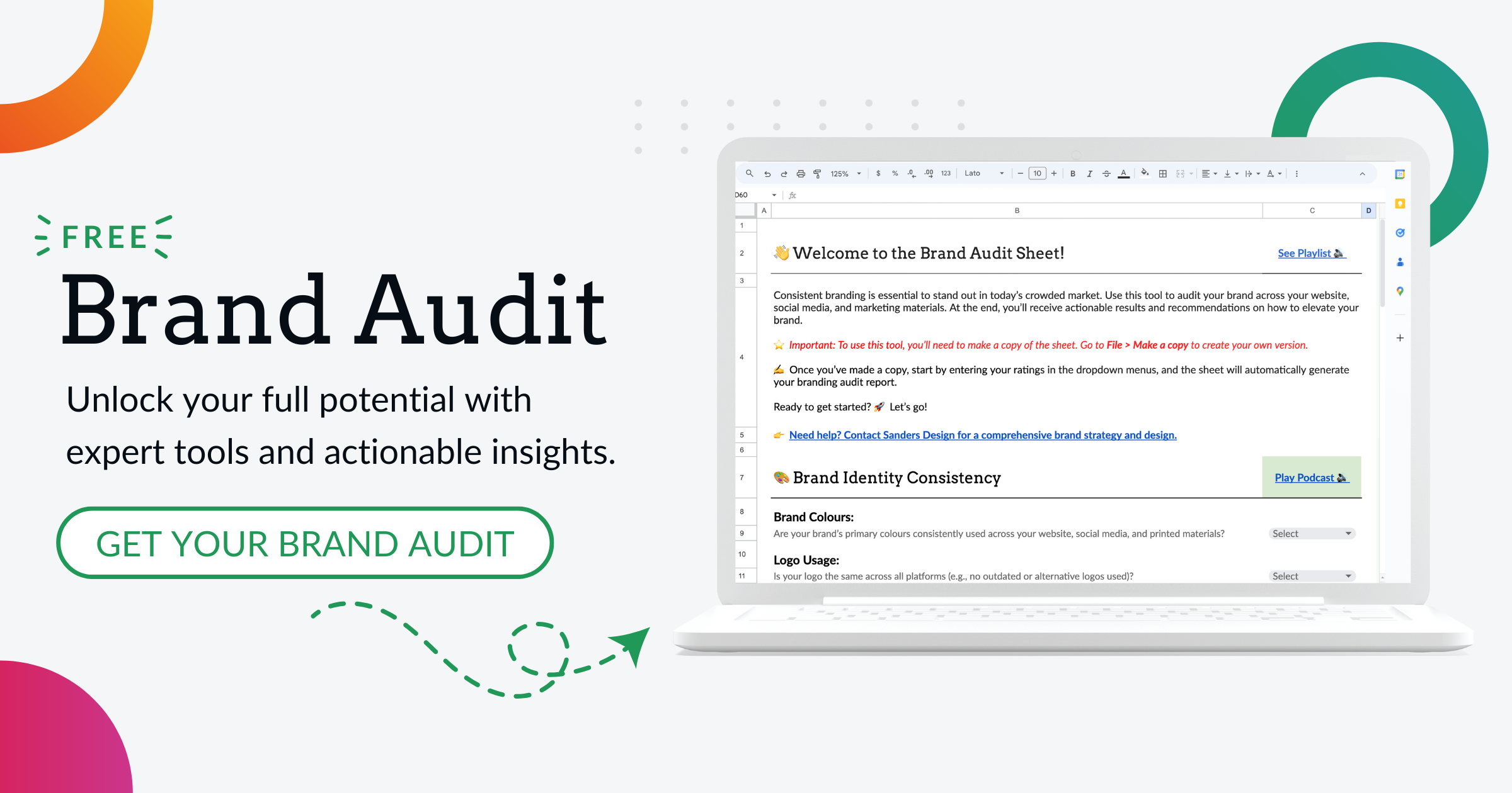
Is Your Logo Consistent Across All Platforms? Here’s Why It Matters
Your logo is more than just a graphic-it’s the face of your brand. Every time someone sees it, whether on a website, social media, or physical storefront, they make a connection with your business.
This connection can only grow if your logo is consistently used across all platforms. In this post, we’ll explain why logo consistency is crucial for building trust and recognition, common mistakes businesses make when handling logo variations, and how to ensure your logo stays uniform across all mediums.
Let’s dive into why keeping your logo consistent is one of the most important things you can do for your brand.
Why Logo Consistency Builds Trust and Recognition
Your logo is often the first interaction customers have with your brand. It represents everything your business stands for, from your values to the quality of your products or services. A consistent logo across all platforms helps reinforce your brand identity and creates a sense of familiarity and trust.
Here’s why:
- Instant Recognition: Think of global brands like Nike or Apple. Their logos are instantly recognizable no matter where you see them. That’s the power of consistency. When your logo looks the same on every platform, people are more likely to remember your business. Over time, this recognition can lead to customer loyalty as people feel more connected to your brand.
- Builds Trust: A cohesive brand experience sends a message that your business is reliable and professional. If your logo looks different across your website, social media, and physical store, it can create confusion and make your business seem disorganized. But when customers see a consistent logo, it reassures them that they’re dealing with a credible and trustworthy company.
- Unified Brand Identity: Your logo should act as the visual glue that ties all your branding efforts together. Whether it’s an online ad, a business card, or product packaging, your logo should look the same. When all elements of your branding-including your logo-are cohesive, it creates a stronger overall identity, helping your business stand out from the competition.
Common Mistakes Businesses Make with Logo Variations

Even well-meaning businesses can fall into the trap of inconsistent logo usage. While it may seem harmless to tweak your logo to fit different platforms or campaigns, these changes can dilute your brand identity over time. Let’s explore some of the most common mistakes:
1. Using Different Versions of the Logo
Sometimes businesses end up using multiple versions of their logo without realizing the impact it has. Maybe you created a simplified version for social media or stretched your logo to fit a banner ad. These small changes can add up and make your brand feel inconsistent. Your logo should look the same no matter the platform, ensuring a cohesive brand experience for your audience.
2. Inconsistent Colours and Fonts
Your logo’s colours and fonts should remain consistent across all platforms. Changing these elements can make your logo less recognizable and weaken your brand identity. For instance, using a different shade of blue on your website than on your printed brochures can confuse customers. Stick to the same colours, fonts, and logo design to build a stronger connection with your audience.
3. Distorting or Stretching the Logo
One of the most common mistakes is resizing the logo incorrectly. Stretching or distorting your logo to fit certain dimensions can make it look unprofessional. It’s important to use vector files that can scale without losing quality and to maintain the correct proportions when resizing your logo for different uses.
4. Failing to Adapt the Logo for Different Backgrounds
Your logo might look great on a white background, but what happens when it’s placed on a dark background? Some businesses make the mistake of not adapting their logos for different contexts, leading to issues with visibility and clarity. It’s essential to have variations of your logo for different backgrounds while still keeping the core elements consistent.
How to Ensure Your Logo Remains Uniform Across Platforms
Now that we know how vital logo consistency is, how can you ensure your logo remains uniform across all platforms? Here are some practical steps to make sure your logo is always used correctly:
1. Create a Brand Style Guide
A brand style guide is essential for maintaining consistency. This document should outline the exact specifications of your logo, including:
- Logo Variations: Define when to use the full logo, icon-only version, or other approved versions.
- Colour Codes: Include the precise colour codes (HEX, RGB, CMYK) for your logo to ensure it looks the same on digital screens and in print.
- Sizing and Spacing: Provide guidelines for the minimum and maximum sizes your logo can be used at and how much space should surround it to maintain clarity.
- Font Guidelines: Specify any fonts used in your logo and whether they should be used in other branding materials.
Having a clear guide ensures that everyone who works with your brand-from designers to marketers-knows how to use your logo consistently.
2. Use Vector Files for Scalability
Make sure you always use high-quality vector files (like .AI or .EPS) for your logo. Vector files can be resized to any dimension without losing quality, so your logo will look crisp and professional whether it’s on a tiny business card or a large billboard. JPEGs and PNGs, on the other hand, can become pixelated when enlarged.
3. Ensure Correct File Formats for Each Platform
Different platforms require different file formats. For example, you may need:
- PNG files with transparent backgrounds for websites or social media posts.
- JPEG files for printed materials or emails where transparency isn’t needed.
- SVG or EPS files for larger format uses like banners or product packaging.
Using the right file format ensures your logo always looks its best.
4. Adapt Your Logo for Different Contexts While Staying True to the Core Design
While consistency is key, there are situations where you may need to adapt your logo without altering its core design. For example, if your logo is usually dark and needs to be placed on a dark background, create a white or light-colored version of the logo. This ensures readability while maintaining consistency with your brand identity.
5. Audit Your Logo Usage Regularly
It’s easy for logo variations to creep in over time, especially if multiple people are working on your branding. That’s why regular audits are crucial. Review your website, social media platforms, printed materials, and product packaging to ensure that your logo is being used correctly and consistently. If you spot any inconsistencies, update those assets to reflect your correct logo.
Conclusion: Practical Steps to Audit Your Logo Usage
If you’re wondering whether your logo is being used consistently across all platforms, now is the time to take action. Here’s how you can audit your logo usage:
- Gather Your Assets: Collect all of your brand’s assets, including your website, social media profiles, printed materials, packaging, and advertisements.
- Check for Consistency: Compare each platform to your brand style guide. Are the correct logo variations being used? Are the colours, fonts, and proportions consistent across all platforms?
- Update Inconsistent Materials: If you find any inconsistencies, update them to ensure your logo looks the same everywhere.
- Create or Revise Your Brand Style Guide: If you don’t have a style guide yet, create one to ensure future consistency. If you already have a guide, review and update it as needed.
- Train Your Team: Ensure everyone involved in your branding-whether internal teams or external designers-understands how to use your logo correctly by providing them with the style guide.
A consistent logo isn’t just about aesthetics; it’s about building a strong, recognizable brand that people can trust. By auditing your logo usage and making sure it stays consistent, you’re reinforcing your brand identity and creating a more professional image for your business.
Need help ensuring your logo is consistent across all platforms? Talk to Sanders Design today, and we’ll help you build a cohesive and memorable brand identity.

Author: Martin Sanders
I empower businesses to connect with their customers and boost sales. Ready to take your revenue to new heights? Get in touch with me today, and let’s make it happen!