How Consistent CTAs Can Boost Conversions and Brand Recognition

Call-to-actions (CTAs) are one of the most critical elements in guiding users through their journey with your brand. Whether it’s prompting a user to sign up for a newsletter, purchase a product, or contact your team, a well-crafted CTA can make all the difference.
Consistent CTAs across all platforms not only help drive action but also reinforce your brand’s goals and identity. In this post, we’ll explore the role of CTAs in driving user engagement, how to ensure their design and copy align with your branding, and offer tips for creating compelling, consistent CTAs that convert. Let’s get started!
The Role of CTAs in Driving User Action

A call-to-action is a clear, concise directive that encourages users to take a specific next step. From “Shop Now” to “Learn More” or “Get Started,” CTAs are essential for guiding users through the decision-making process and ultimately leading them to convert, whether that means making a purchase, signing up for an email list, or downloading a resource.
Here’s why CTAs are so important:
- Encourages Immediate Action: Without a strong CTA, users might not know what step to take next. A clear, compelling CTA directs them to act right away, which can significantly boost conversions. Whether it’s “Buy Now” or “Get a Free Quote,” a well-placed CTA can provide the nudge users need to move forward.
- Reinforces Brand Goals: Every CTA should align with your brand’s goals. Whether your focus is on driving sales, growing your email list, or increasing engagement, your CTAs are a direct reflection of what you want users to do. Consistently using CTAs that match your brand’s objectives reinforces these goals and makes it easier for users to follow through.
- Improves User Experience: Clear CTAs make it easier for users to navigate your website or app, guiding them to what they need or want to do next. A user-friendly experience leads to higher engagement and, ultimately, more conversions.
Ensuring CTA Design, Copy, and Placement Align with Your Branding

Consistency is key when it comes to CTA effectiveness. The design, copy, and placement of your CTAs should all align with your overall branding to create a seamless experience for users.
1. CTA Design
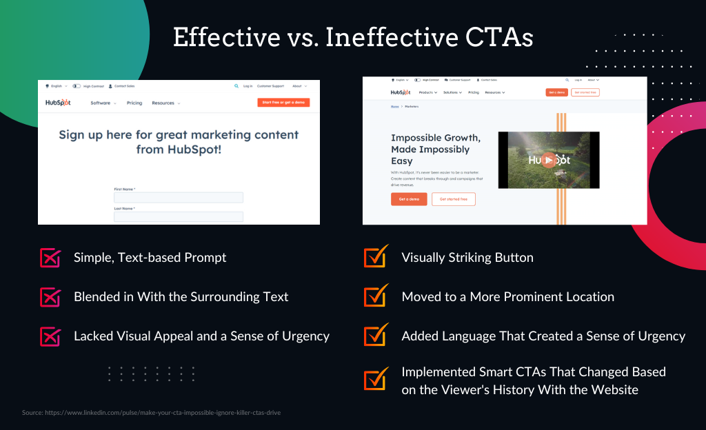
Your CTA buttons or links should be visually appealing and consistent across platforms. The design should reflect your brand’s identity while ensuring the CTA stands out enough to grab attention.
- Colour: The colour of your CTA should contrast with the background while remaining in line with your brand’s colour scheme. For example, if your brand colours are blue and white, using a complementary colour like orange or green for the CTA can make it pop without clashing.
- Size: CTAs should be large enough to be easily clickable on both desktop and mobile devices, but not so big that they dominate the page. Consistent sizing across your website, emails, and social media helps create a cohesive look.
- Shape and Style: Whether you choose rounded buttons, rectangles, or bold text links, stick to one style. This consistency reinforces your brand’s visual identity and ensures your CTAs are instantly recognizable.
2. CTA Copy
The language you use in your CTA copy should reflect your brand’s tone of voice and be action-oriented. The goal is to inspire users to take immediate action, so the language should be clear, direct, and aligned with your brand’s personality.
- Be Clear and Concise: Avoid complicated or vague language. CTAs like “Sign Up Now,” “Get Your Free Trial,” or “Download the Guide” tell users exactly what to expect.
- Reflect Brand Tone: Your CTA copy should be consistent with your brand’s overall tone of voice. For instance, if your brand is playful, your CTA could be more casual and fun, such as “Let’s Go!” or “Grab Yours Now!” A more formal brand might use language like “Discover More” or “Request a Consultation.”
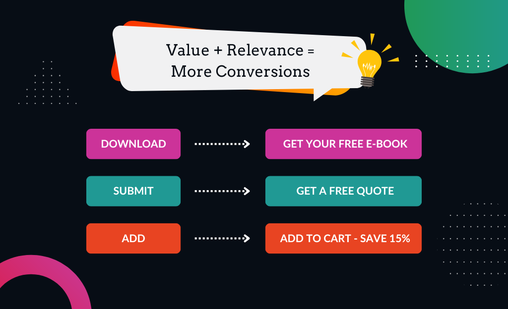
- Incorporate Value: Emphasize the benefit to the user. CTAs that highlight value, such as “Get Your Free Quote” or “Start Saving Today,” are more compelling because they immediately communicate the advantage of taking action.
3. CTA Placement
Where you place your CTAs can significantly impact their effectiveness. Consistent placement ensures users can easily find and interact with them no matter where they are on your site or which platform they are using.
- Above the Fold: Placing CTAs at the top of a page ensures they are visible as soon as the page loads, prompting immediate action.
- Throughout Content: For longer pages or blog posts, placing CTAs at multiple points-such as mid-page or at the end-gives users several opportunities to engage without feeling pressured.
- Consistency Across Platforms: If you have a “Shop Now” button on your website’s homepage, it should be placed in a similar position on your social media profiles and email campaigns. This consistency helps build familiarity, allowing users to know exactly where to look for the next step.
Tips for Creating Consistent, Compelling CTAs
Now that we’ve covered the basics of CTA design, copy, and placement, here are some actionable tips for ensuring your CTAs are both consistent and compelling:
1. Develop CTA Templates
To maintain consistency, create templates for your CTAs that can be reused across all platforms. These templates should include the button design, colour scheme, and standard copy options, ensuring your CTAs are easily recognizable and aligned with your brand.
2. Use Action Words
Your CTA should prompt users to take immediate action. Start your CTA with a strong action word like “Get,” “Download,” “Buy,” or “Sign Up.” These words create a sense of urgency and guide users on what to do next.

3. A/B Test for Effectiveness
Test different versions of your CTAs to see which ones resonate most with your audience. Try different colours, copy variations, or placements to determine what drives the most engagement and conversions. Once you find the most effective combination, standardize it across all your platforms.

4. Stay True to Your Brand
It’s tempting to use generic CTAs like “Click Here” or “Submit,” but these don’t add value or reflect your brand’s unique voice. Stick to CTAs that are specific to your brand and its goals, and make sure they reflect your overall tone of voice.
5. Keep the User in Mind
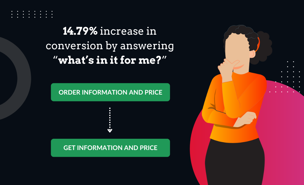
Your CTA should always focus on the user’s needs and the benefits they’ll gain by taking action. Use phrases that highlight what’s in it for them, such as “Get Instant Access,” “Claim Your Free Trial,” or “Start Your Journey.” This shifts the focus from what you want to what the user stands to gain.

Conclusion: Simple Ways to Unify Your CTAs

Consistent CTAs can drive conversions, reinforce your brand’s goals, and improve user experience across all platforms. Here are some key takeaways for unifying your CTAs:
- Audit Your Current CTAs: Review your website, social media profiles, and marketing emails to ensure your CTAs are aligned in design, copy, and placement.
- Develop CTA Templates: Create reusable templates that maintain the same design and copy elements, ensuring brand cohesion across platforms.
- Optimise for Action and Value: Use action words and emphasize the benefits to the user in your CTA copy.
- Test and Refine: Regularly test different CTA variations to determine which combinations drive the best results, and standardize those across your brand.
By creating consistent, compelling CTAs, you not only boost conversions but also create a more unified and recognizable brand presence.
Need help crafting CTAs that convert? Contact Sanders Design today, and we’ll help you design powerful, consistent CTAs that drive engagement and align with your brand’s identity.


Author: Martin Sanders
I empower businesses to connect with their customers and boost sales. Ready to take your revenue to new heights? Get in touch with me today, and let’s make it happen!


